I made this thinking it does something similar.Though I just noticed, and this may be a stretch, but because of the way the F U and N line up but the O doesn't, it kinda says FUN, inside it!
This comment has been removed by the author.
This one has a nice feeling too it, but it reminds me of something I've seen before
err i think i've changed my mind, to preferring this layout of the type. It's alot easier to work with, but i'd say all designs are easy to read
I like this a LOT. I was thinking about how we're working within the system, or the proverbial box, but shaking it up just a little:)
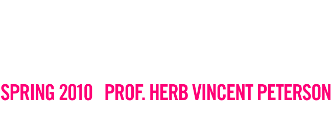
THIS IS THE ONE TO USE... Nicely done Ryan.
Note: Only a member of this blog may post a comment.

I made this thinking it does something similar.
ReplyDeleteThough I just noticed, and this may be a stretch, but because of the way the F U and N line up but the O doesn't, it kinda says FUN, inside it!
This comment has been removed by the author.
ReplyDeleteThis one has a nice feeling too it, but it reminds me of something I've seen before
ReplyDeleteerr i think i've changed my mind, to preferring this layout of the type. It's alot easier to work with, but i'd say all designs are easy to read
ReplyDeleteI like this a LOT. I was thinking about how we're working within the system, or the proverbial box, but shaking it up just a little:)
ReplyDeleteTHIS IS THE ONE TO USE... Nicely done Ryan.
ReplyDelete